Designed key features of Distributed Selling application, that enables users such as a CSR or store associate to view and enter new customer orders and modify existing orders. Led design efforts in features for exchanging items, adding returns to exchanges, enhanced item search, and adding Value Added Services to an order.

High-Level Product Goals
- Re-build the original order management system geared towards customer service representatives (CSR) to help them perform their tasks more efficiently and effectively.
- Re-design 'create order' flow with capabilities to add promotions, coupons, appeasements and value added services
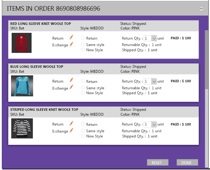
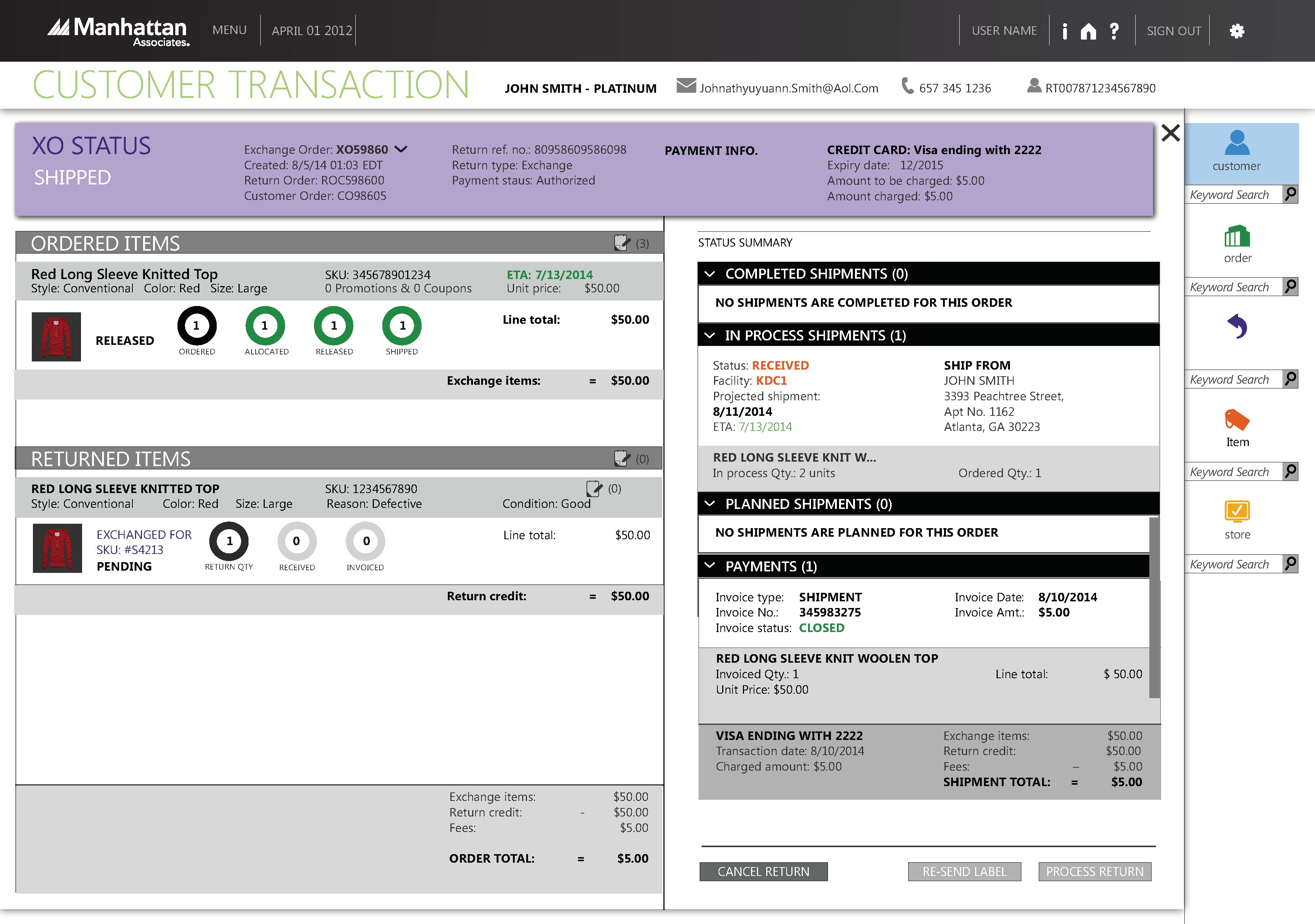
- Add flows to support return and exchanges (for like items as well as any item) for the new order management system.
- A smart item-search screen that would facilitate shopping experience for the customer over the phone.
Design Level Goals
- Reduce the amount of training time for the CSRs by surfacing the right information at the right instance of the conversation - This was the guiding design goal aimed towards CSR organization that faces high attrition rate. In big organizations, a lot of CSRs on the phone are entry-level trainees.
- 90% of end customer transactional data should be available to CSRs in 2-clicks away.
- CSRs should be able to execute an uninterrupted flow of creating an order in the system which includes but not limited to applying coupons and promotions to the orders.
Initial Challenges
- Initially, with limited access to the end user (CSRs), we primarily relied on the internal expertise of Product Management and Sales teams, to get the contextual famliarity. This resulted in multiple iterations in the requirements gathering phase to get the stakeholders' consensus on the key problems we are trying to solve. However, through the course of this project, we were able to show the value of UX team directed user research, and this set the tone for this and subsequent initiatives.
- The existing application was a massive behemoth of screens spread across the application. CSRs had to go through 5 to 6 screens (which were not tied together) to execute a simple use case of answering the end customer’s order status.
- Initial requirements were to display a lot of data on the same screen. We ran through multiple iterations to find the fine balance between essential data and functionality for the key screens that were common to most use-cases.
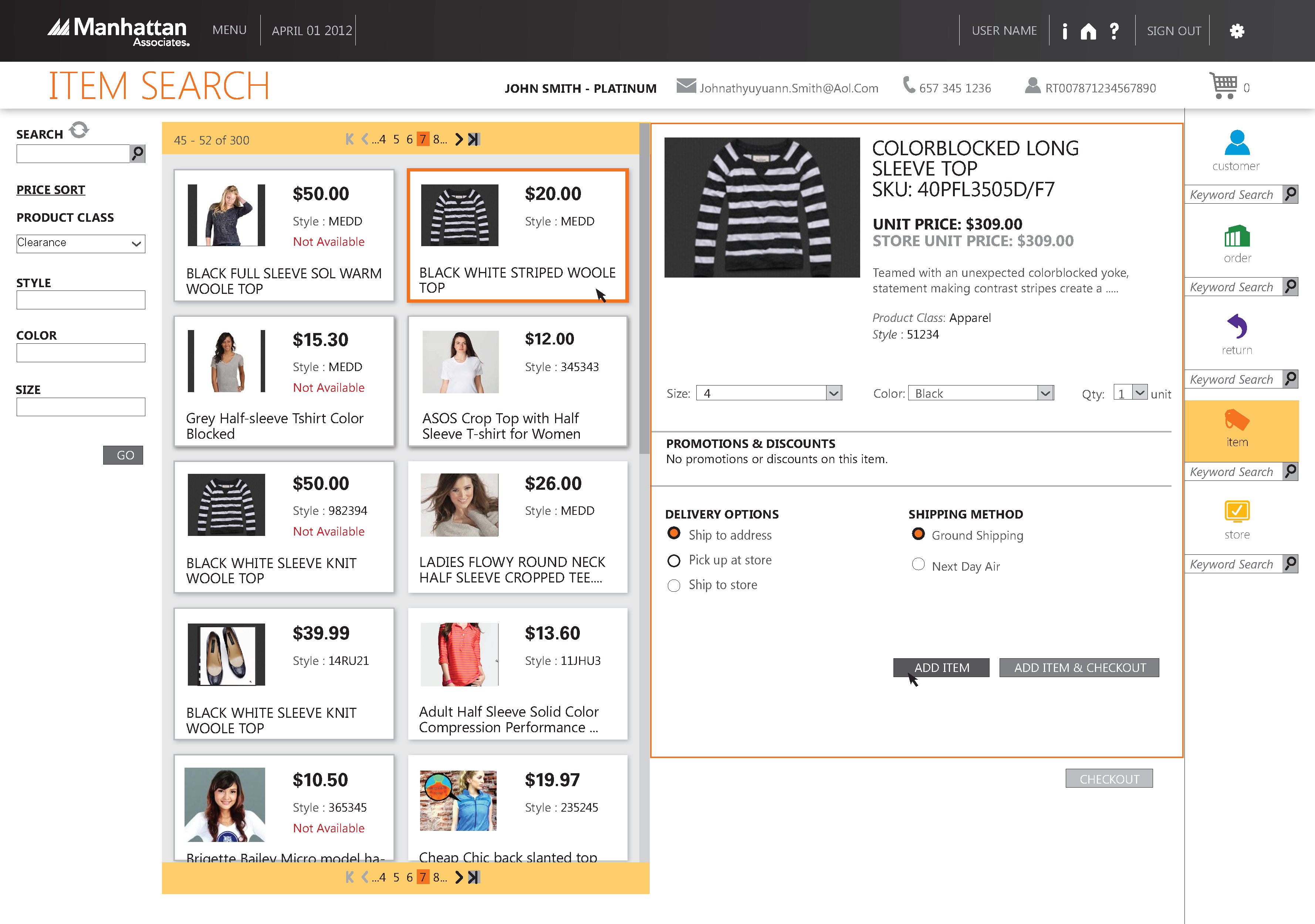
- The original item search screen was very rudimentary which had very simple capabilities of finding an item if the CSR has the exact item SKU. That did not compare well with the retailers' website experience that customer on phone was using to place their order.
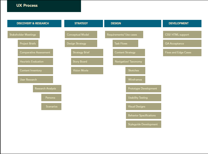
UX Process
Below is the overall process flow we used to rebuild these original order management system screens.
We documented the overall service flow that would enable us to design for various touchpoints and scenarios. We mapped out the basic user flow between CSRs and end customers and sketched out ideas for improvement. This helped us with envisioning the future improvements and how getting them validated.
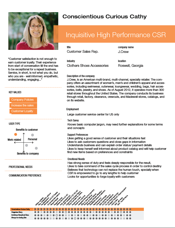
We observed CSRs, interacted with CSR supervisors, managers and fulfillment Specialists. We defined detailed personas that were later shared with Product management, Dev. teams and other stakeholders. The personas looked something like this:
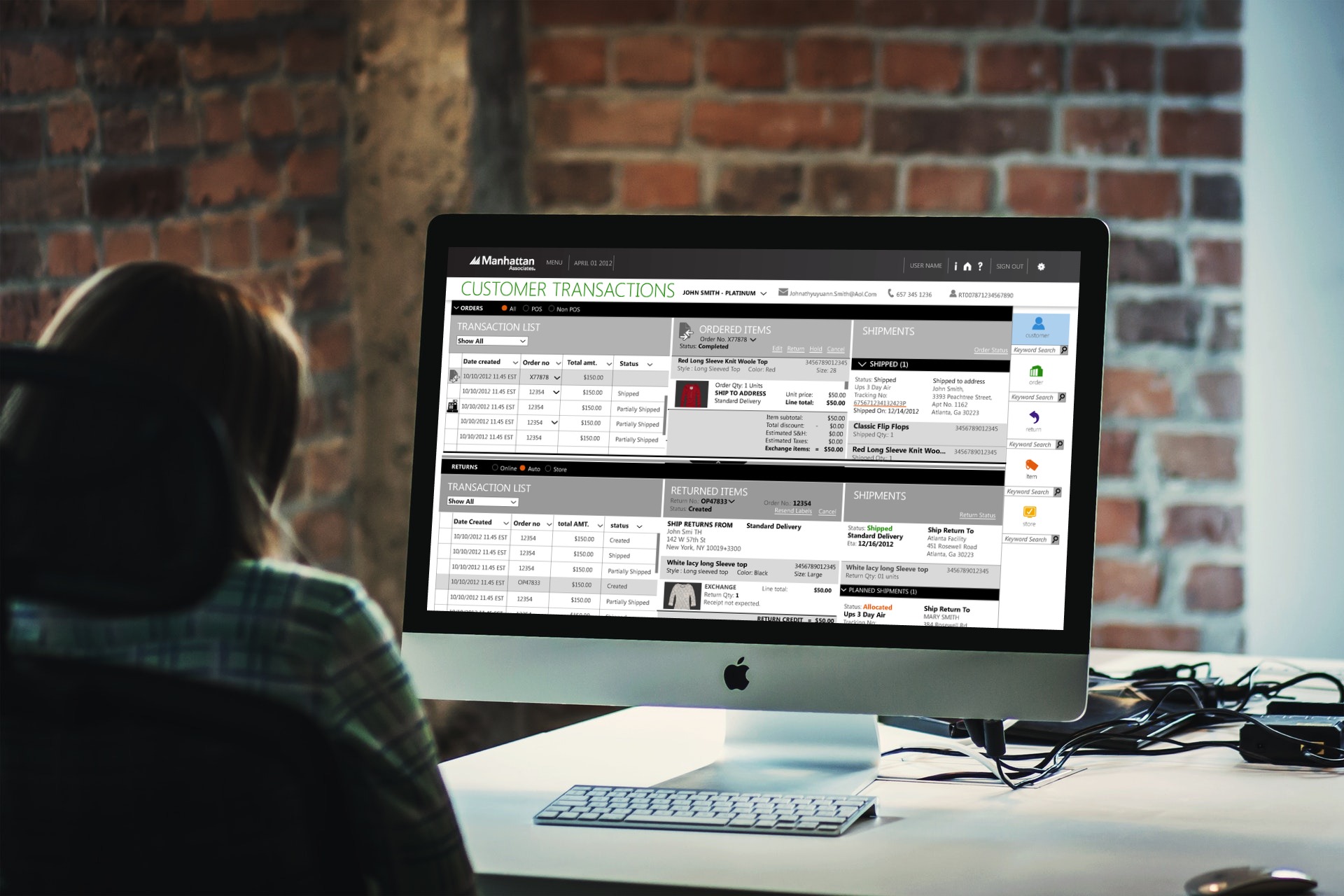
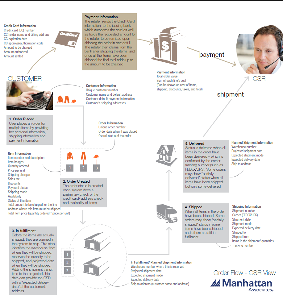
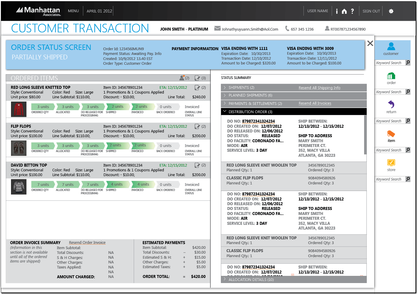
While evaluating the existing application, we observed early on that for the most common scenario (WISMO - where is my order) was not supported very well by the existing application. The key information was scattered across screens and unless the CSR is fully trained, they will not know where to access what information in the fastest possible way. Even the trained CSR had open a note-pad on the screen to copy and paste critical information from one screen to another. For shipment delays and mis-shipments, customers calling in were already frustrated and impatient and CSRs were often put on the spot for not valuing customer's time. Because of this, any delay in CSR side was not considered good service. Below is one screen from the original application.
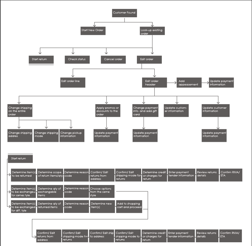
We considered the original sitemap to make improvements.
No! That was not working. We had to cut that down.
We built a new sitemap understanding all customer requirements, to tie all the screens together.
We realized that we needed to get the critical piece of information together and make more information-rich screens. The challenge was deciding how much of information will fit on one single screen and what information should appear first. The fine balance between the right amount of information and functionality took fair amount of churning but eventually, we were able to come up with designs that got positive feedback from the internal and external stakeholders.
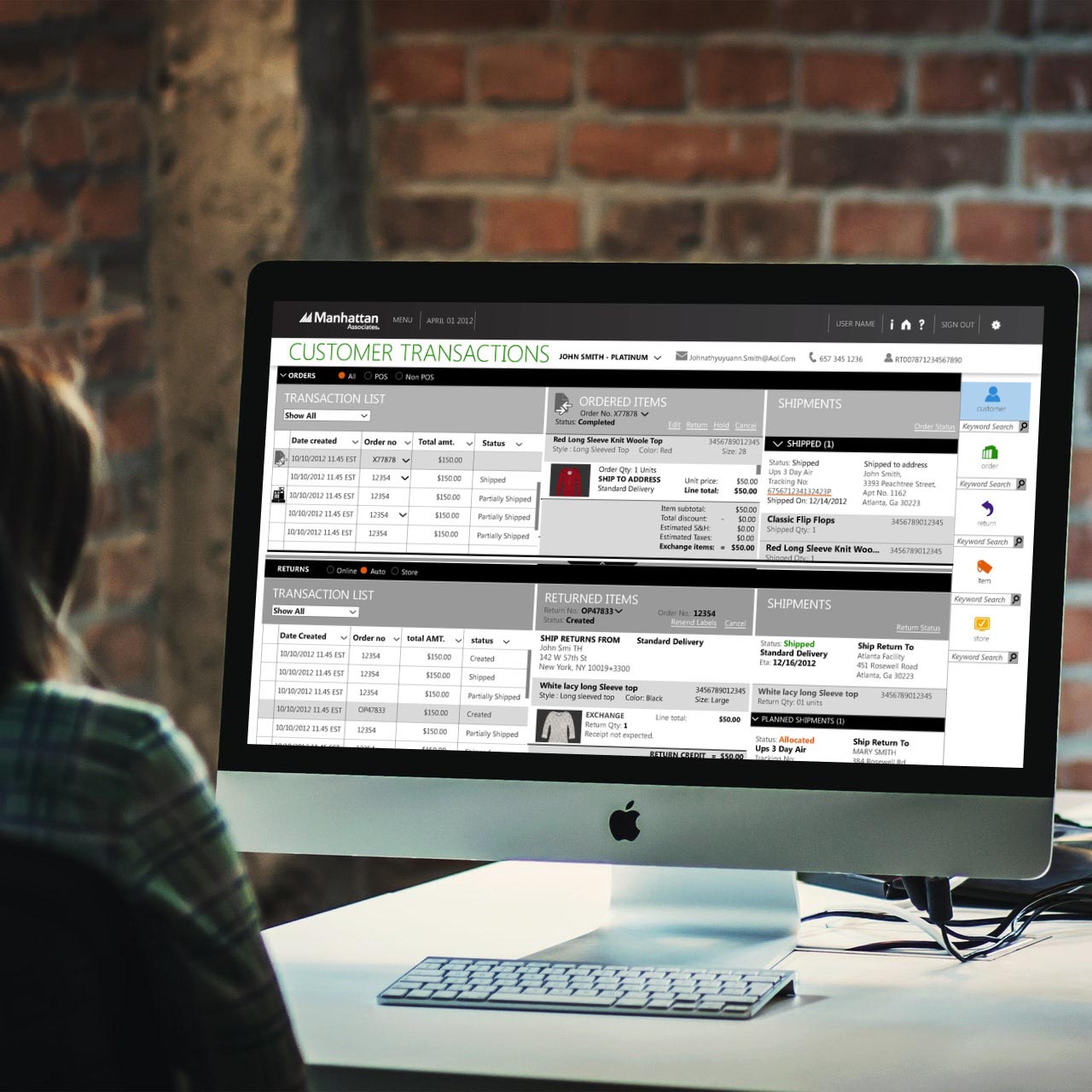
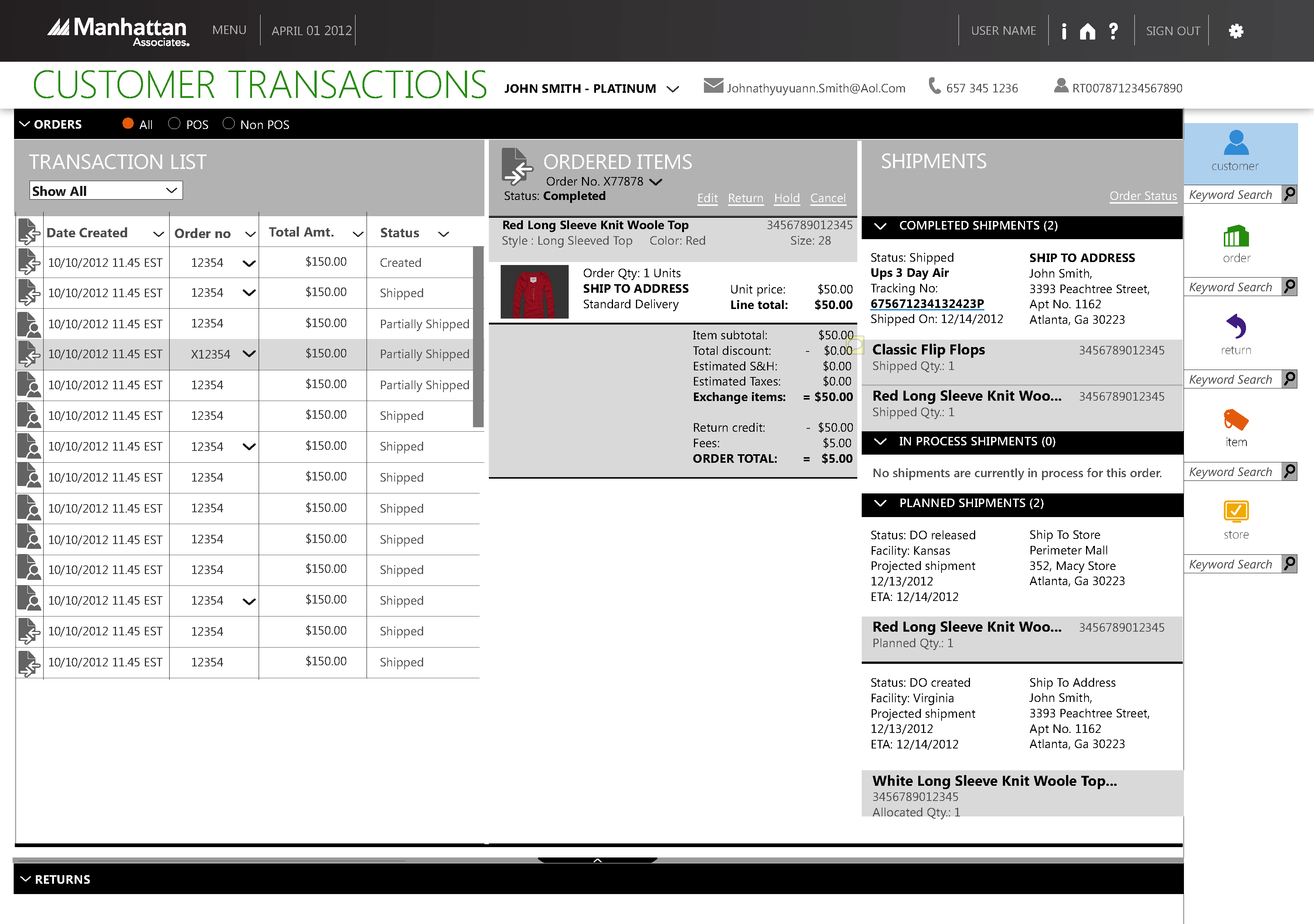
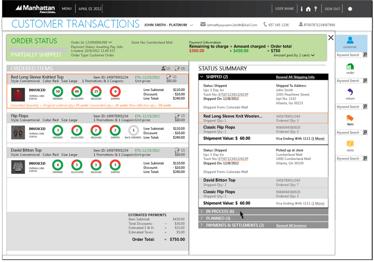
We relied on the synced list pattern that revealed information progressively on one screen, but within 2 clicks away. Towards the end, to get to complete order details from the landing page, CSR was only 2 screens away.
In the first screen, customer transaction screen, CSR was able to get 90% of the data that the customer was calling for. While he is on phone, CSR can react to the right information, as opposed to asking the customer some filler questions while attempting to access the right screens. This also helped to reduce the amount of training that the CSRs would need.
This screen went through several iterations to make sure that all the common use cases were covered. We were able to predict the data required to answer most of the frequently asked questions from the end customers from the requirements gathered from CSR.
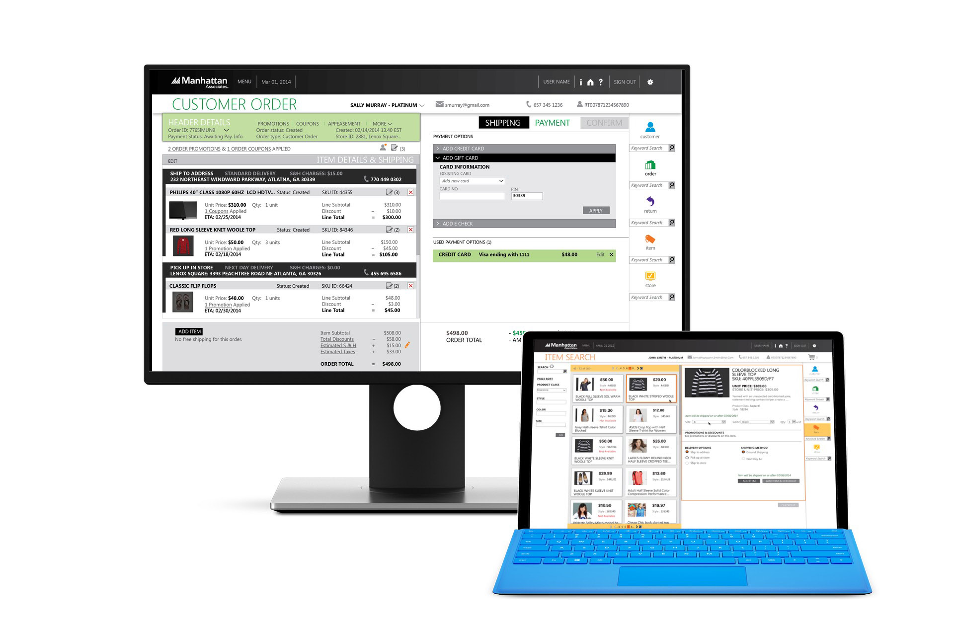
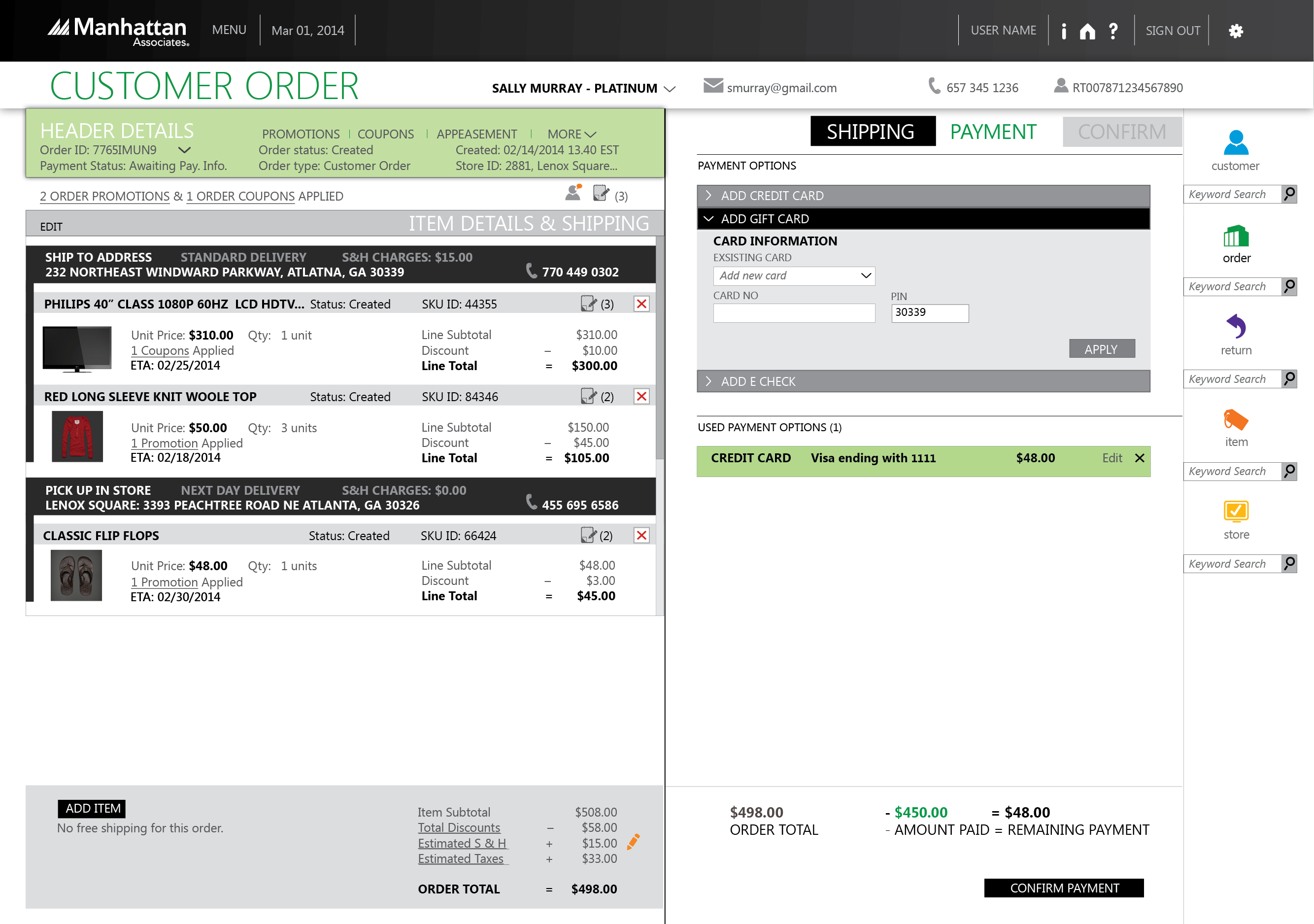
For the create customer order entry flow, the original design used 6-9 screens, depending on the complexity of the order. We kept on improving it and came up with 4 screens to help the CSRs process end customer’s new order. On one screen, through different tabs, we were able to provide a wizard-like flow that mapped well with the mental model of CSR and facilitated the conversation with the customer to create an order. We designed it to go through shipping, payment and confirmation in one flow.
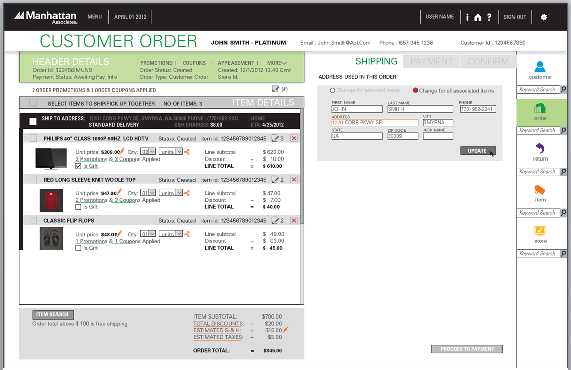
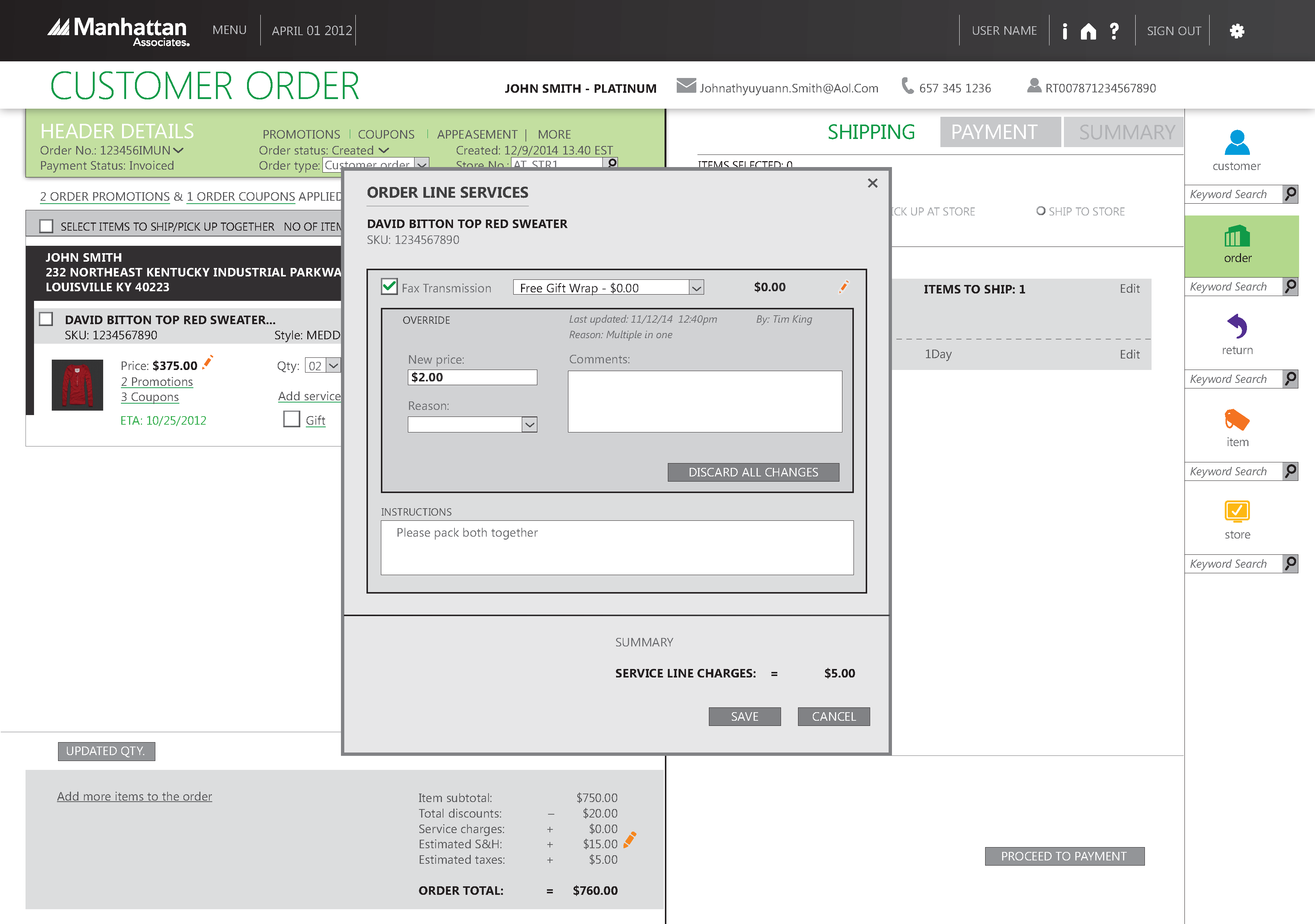
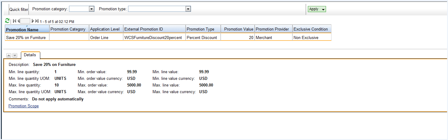
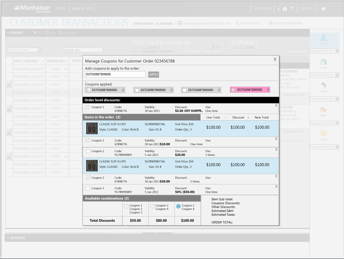
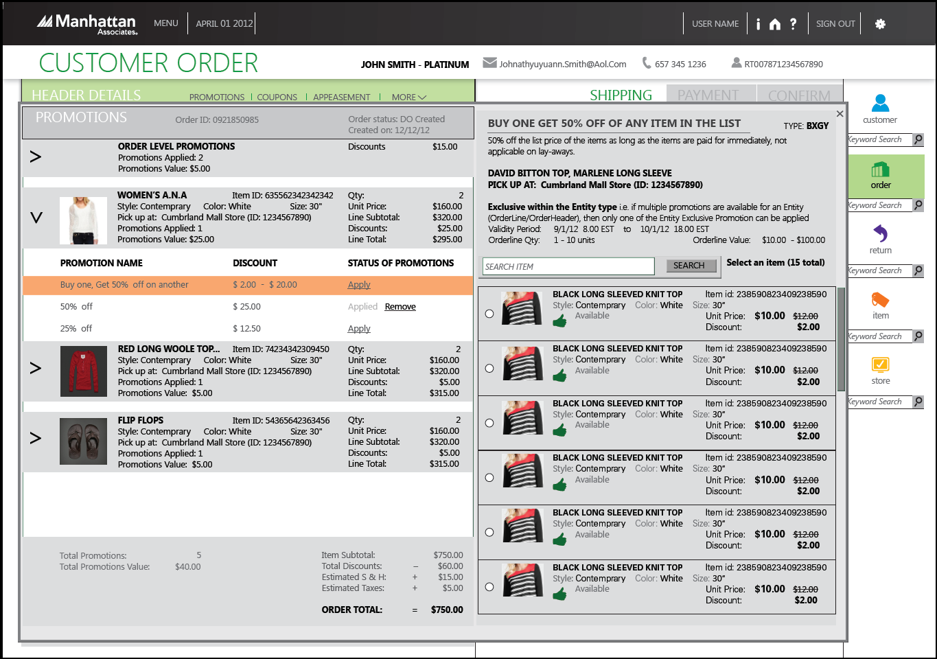
Once we built the customer order on one screen, we decided to enhance the experience by bringing in other screens like promotions, coupons as pop-ups.
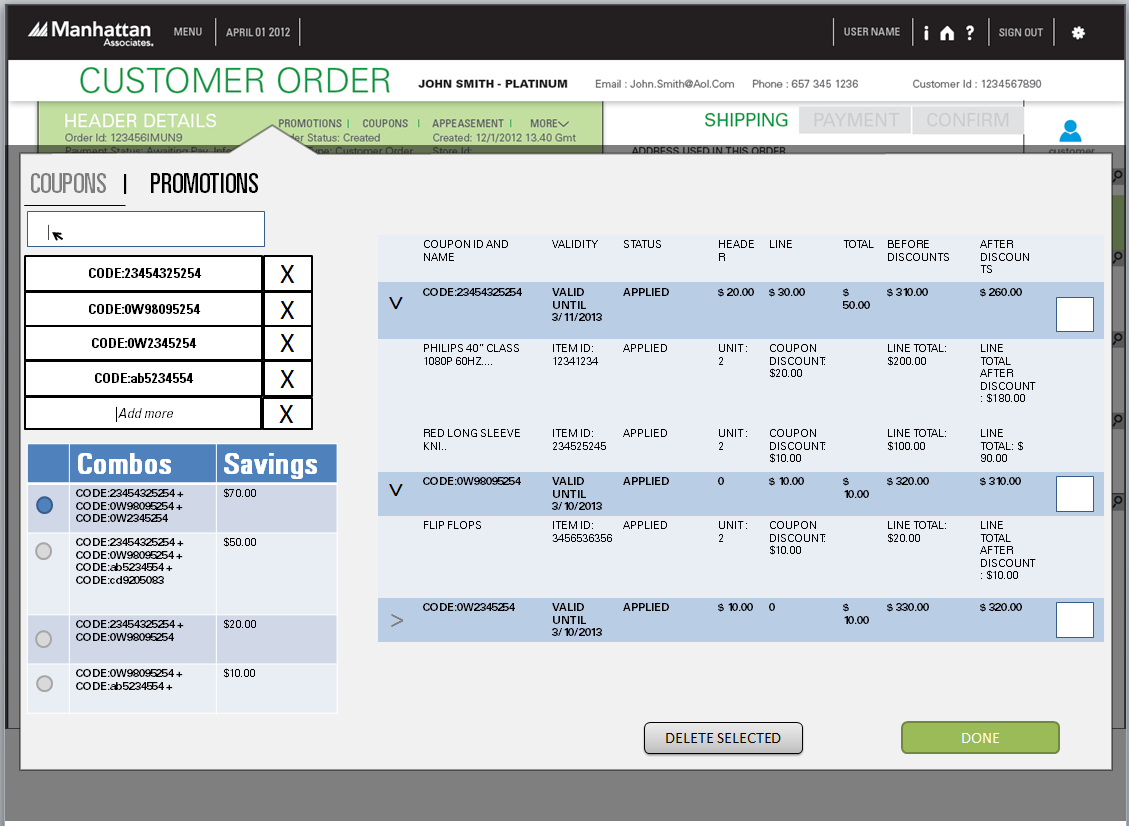
In true order flow, coupons and promotions are optional steps in the order-placing-process which customer over the phone may want to use at any time. We do not want CSRs to be restricted in creating order and go to a separate screen to update promotions and coupons. Also, when the CSR is filling up shipping address and confirming an order, and if the customer remembers to add some coupons, we did not want to interrupt the flow to enter coupon and promotions. So, we found it more and more beneficial to fit in promotions and coupons on the same screen. Below is the v2 of the mockup:
We did a lot of re-iterations even for smaller versions like coupons in more enterprise domain. There were scenarios that needed to be addressed like:
- What if coupon and promotion does not work very well
- What if end customer has multiple coupons, and all they care about is saving lot of money
- Traditional system CSR must think about what is the money saved on the coupon. This new proposal lets the CSR put all coupons in one shot and system would tell that the combination of coupon and promotion will help the end-customer save more money. This brought customer delight.
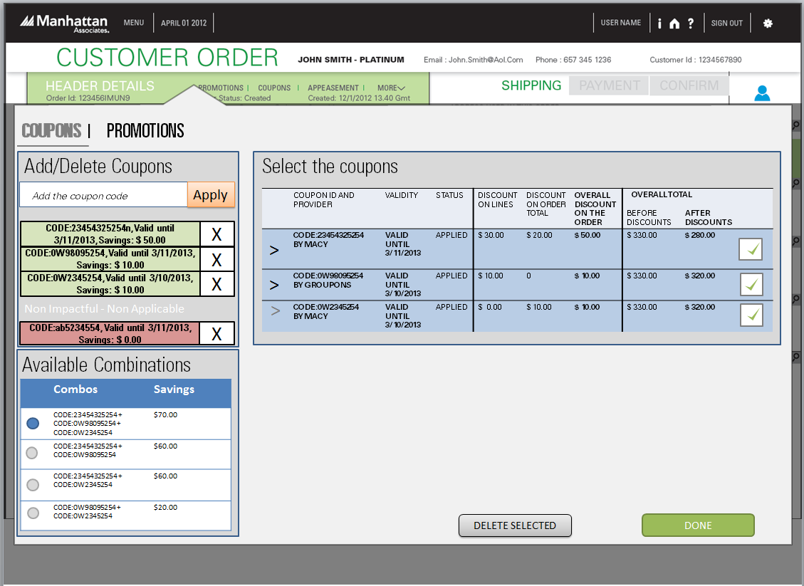
Below is the final version of the coupon and promotion screen, we came up with:
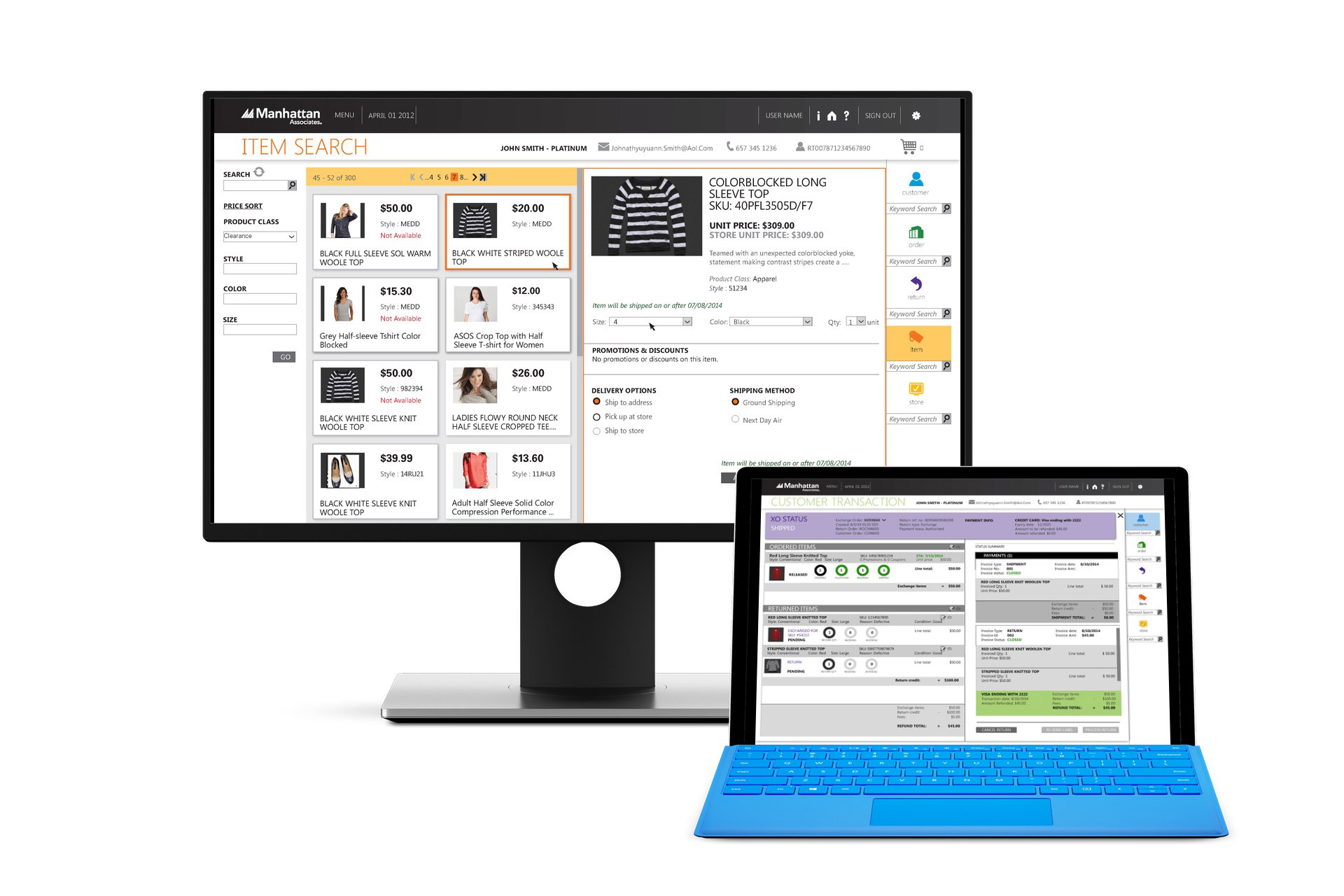
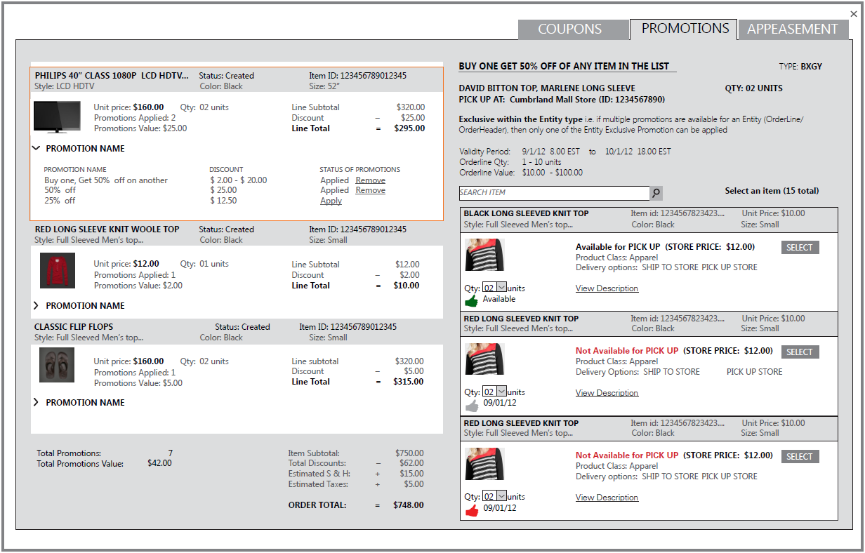
These are incremental versions of promotional screens (for different use cases) we worked on along with low fidelity mockups that were created during the process. Also, we designed smart search capabilities by providing search and filters on more attributes. It was initially spread to 2 to 3 pages. We consolidated into one flow by accommodating where CSRs could search for items, find the list of things, see the details of the individual items in a single click and they could immediately check out or they can keep on building the cart.
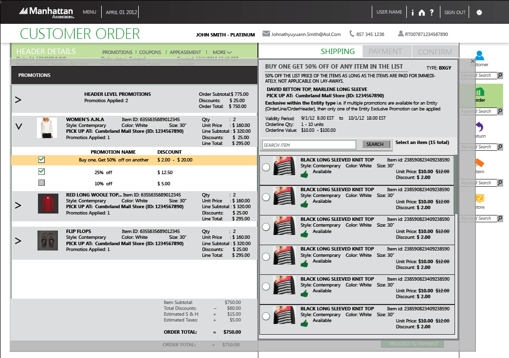
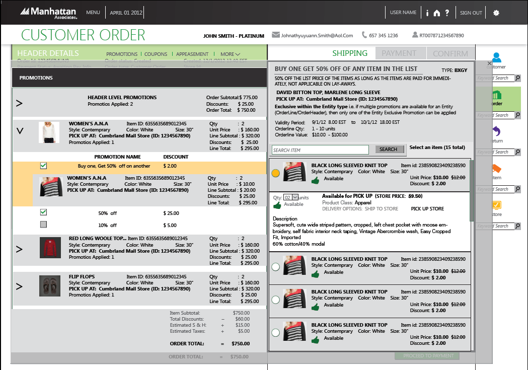
Header Level Promotions
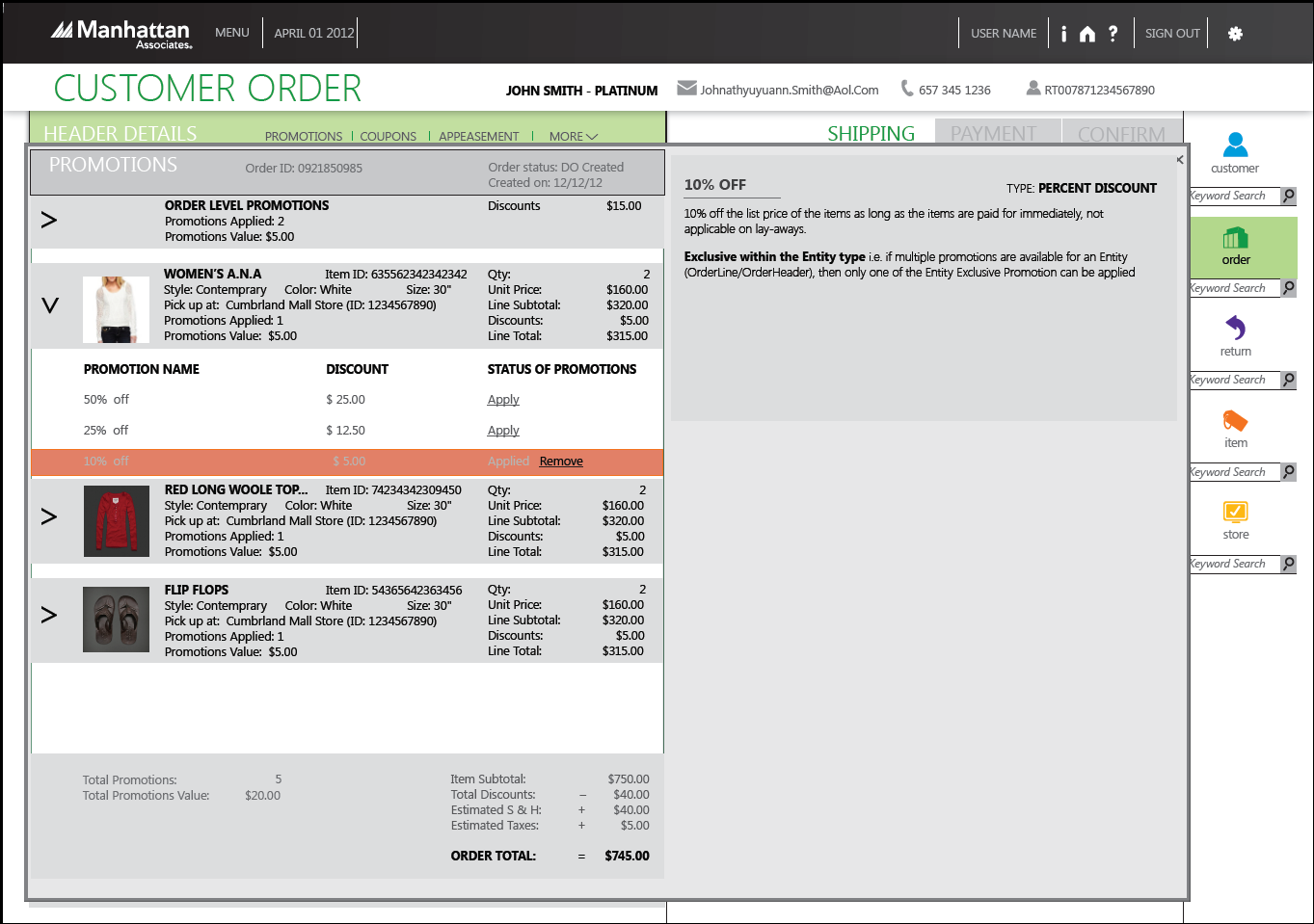
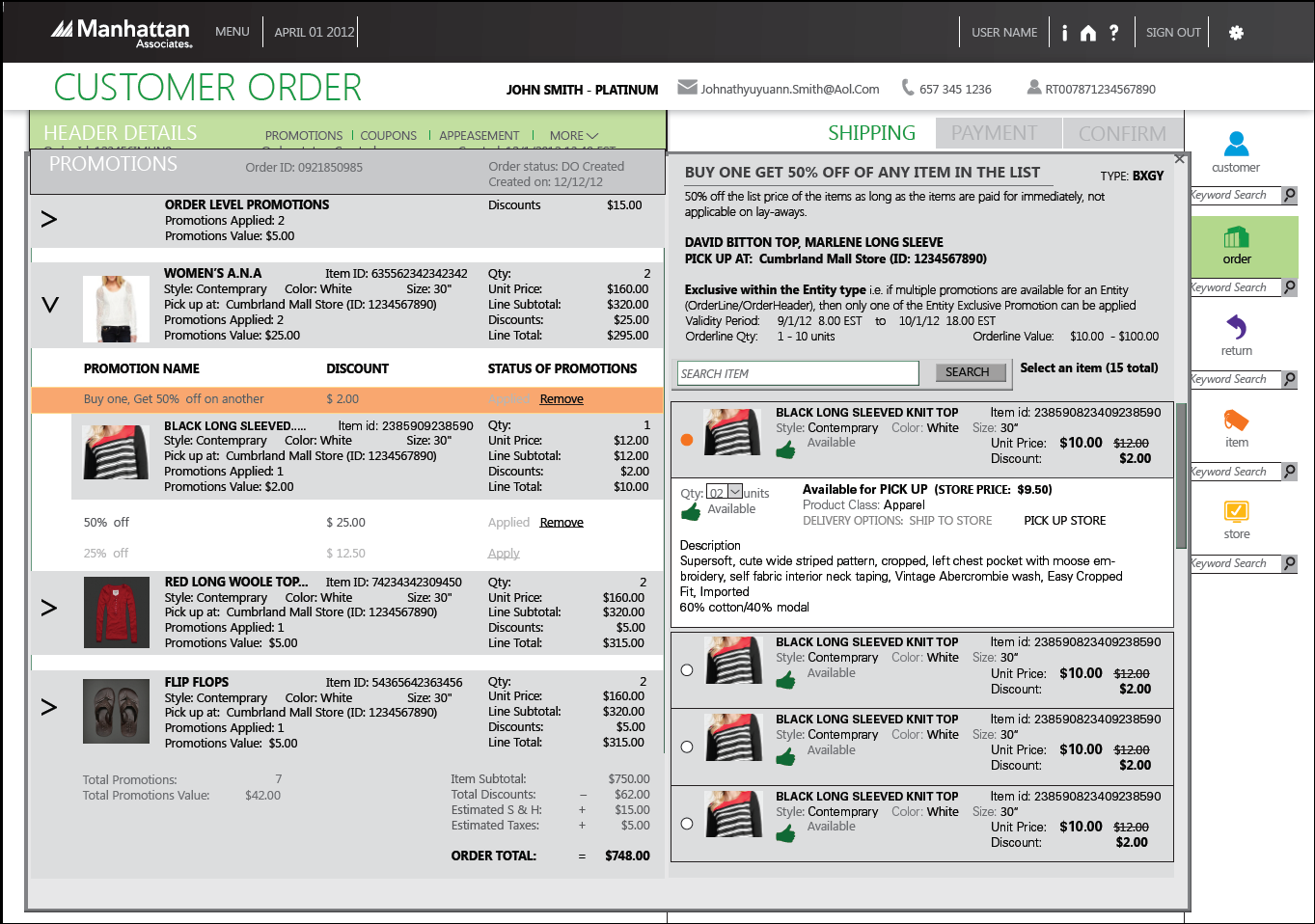
Order Level Promotions
This is the final version showing promotions, coupons and appeasements, along with low fidelity mockups:
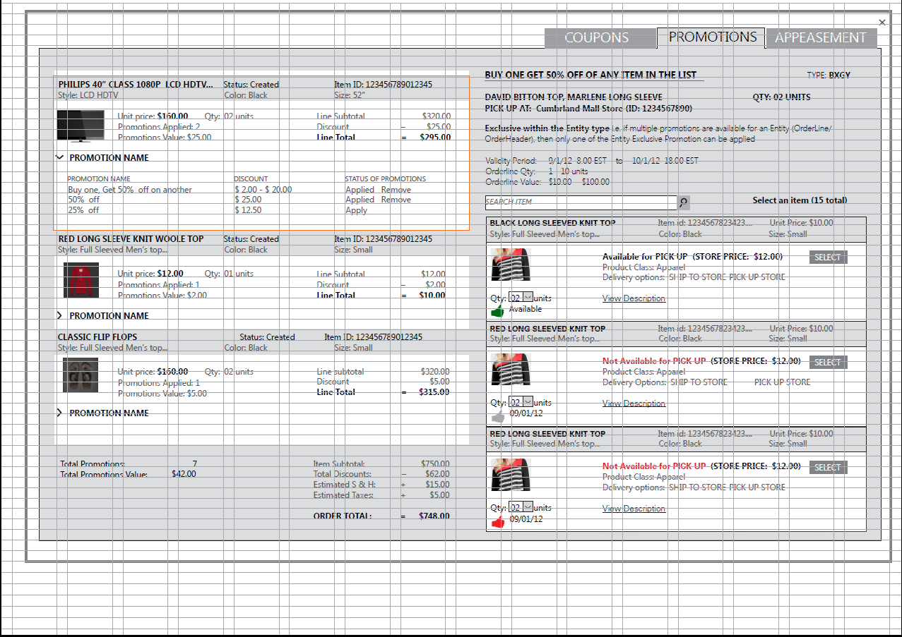
Once we reached the final revisions, we put it on a grid and specified individual visual specification of individual elements. Additionally, a separate document was provided that detailed out interactions on the static screens to assist the off-shore development team in creating these screens.
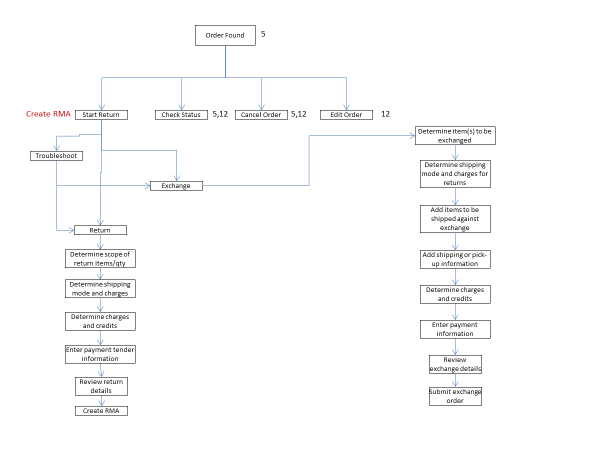
We also created the online return and exchange flow for the customers in our system. This allowed them not only to buy online but they could also return/exchange online.